This is my personal project that I worked with three Columbia MBA students. They had a great idea but needed someone to shape their idea into a real app that people would want to use. I led this project as a main UX/UI designer from information architecture to wireframe and Jane Yoon helped me specially on visual and UI design as well as branding. Also, I closely worked with an iOS developer to build a beta version of our app.
Background
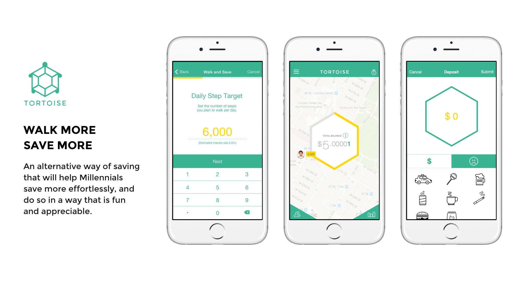
Most financial institutions care about your wealth, not your health. Tortoise is a mobile savings platform that makes saving easy and fun for Millennials through fitness improving activities, and gives new meaning to saving in that the total saving amount accounts for actual improvements in health.
Problem Space
- Millennials think putting money in banks is boring: 53% don’t think their bank offers anything different than other banks; 73% would be more excited about financial services from non-traditional banks.
- Savings is unnatural and requires too much discipline.
Source: Millenial Disruption Index, a three-year study of 10,000 Millenials surveyed by Scratch Media Network
Research
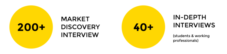

“Right now I’m putting [money] in the pension fund like $100 per month. But that’s [planning] for the long run. Currently I’m not saving any money in banks.”
“I have a different sort of savings plan. Based on the day, I put that amount in my savings account. So if today is the 26th, I would put $26 in my account.”
“If I made X a year, I try to save as much as I can. But then it’s not thought of on a daily basis.”
Key Findings
- The value of saving money is arbitrary.
- There is lack of motivation for saving money.
- There aren’t many engaging ways to save money that is targeted at Millennials.
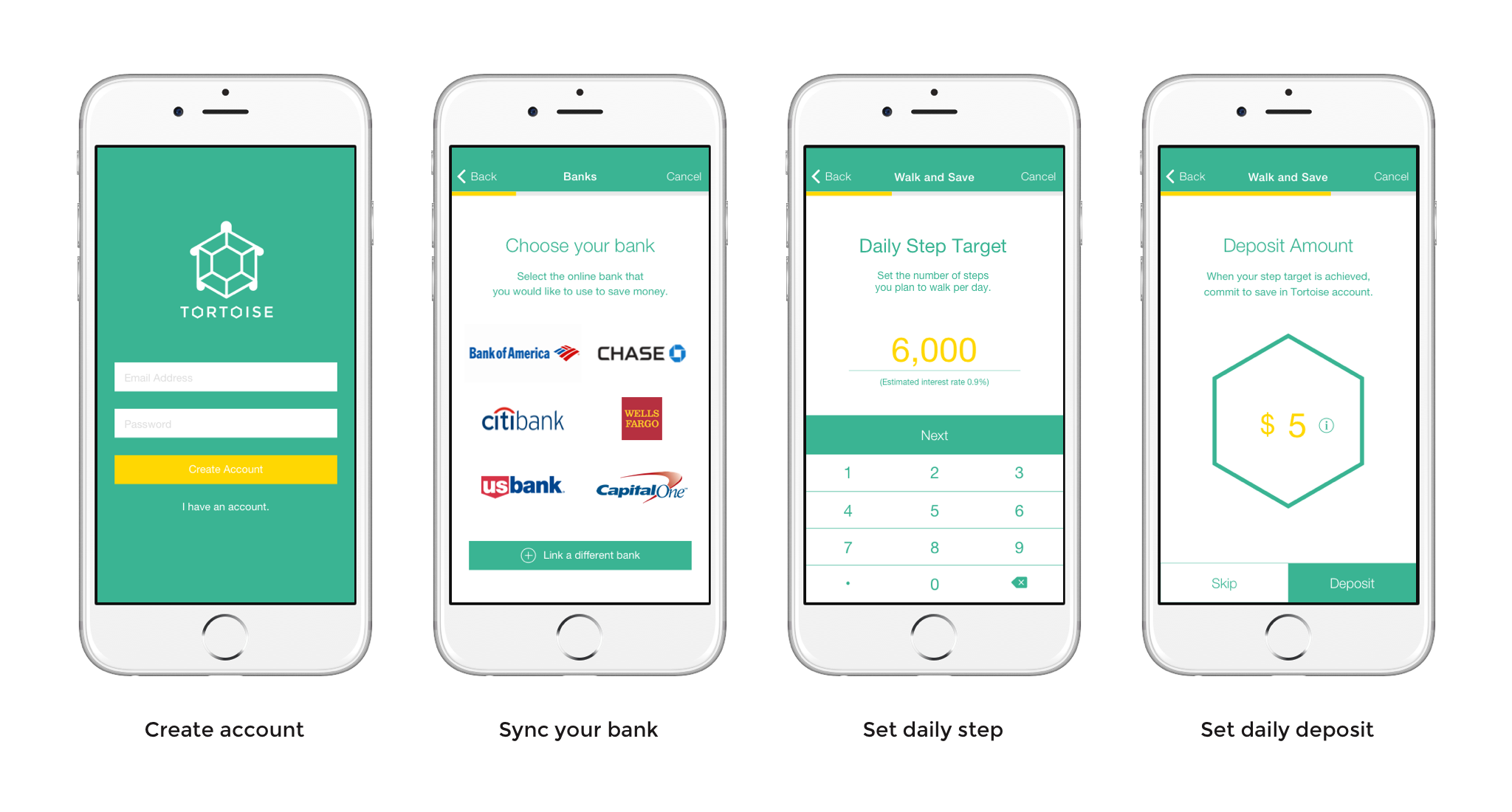
User Journey
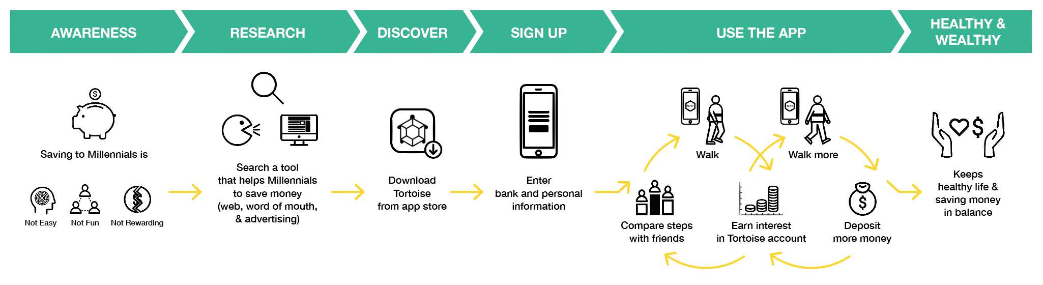
Process
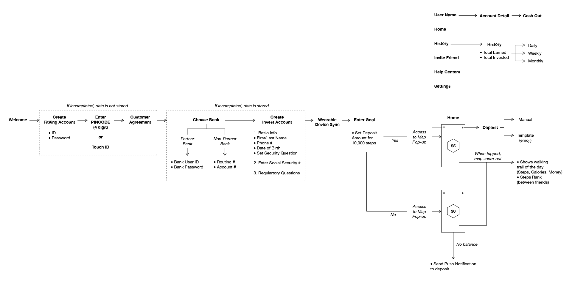
We refined the concept with the research outcomes and went through a few rounds of iteration from white board sketch to digital wireframe. I also created the flow map to communicate structure and hierarchy more easily with other team members.
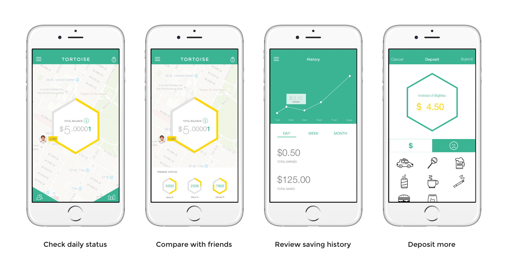
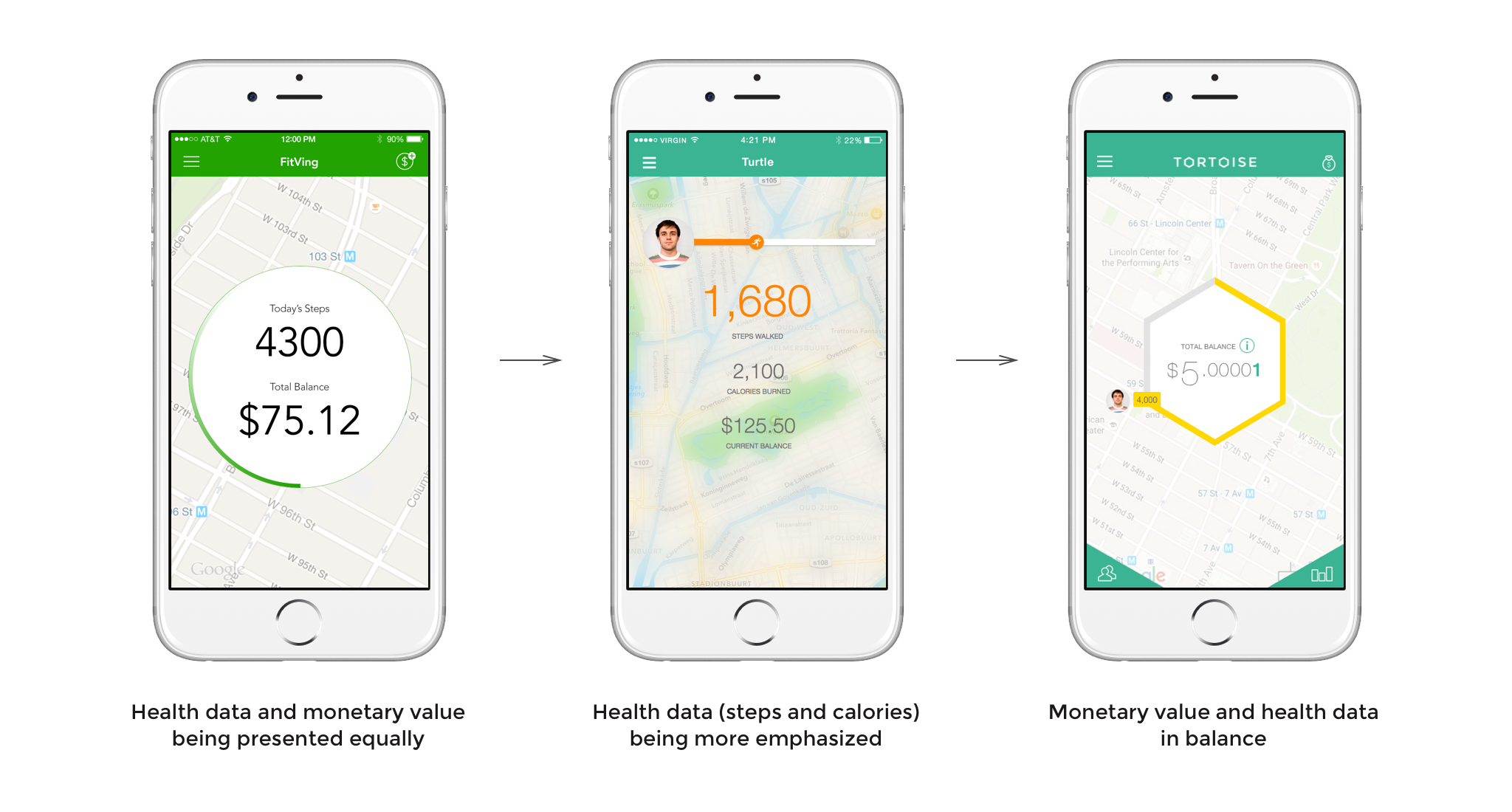
Key point in our app design was showing live map as a background on home screen. And our biggest design challenge was finding a harmonized way to display health data and monetary value on top of the map. The ultimate goal of using our app was to save money so the monetary value needs to be shown up front. But at the same time, users would earn more interest on their saving by walking(exercising) more so showing health data would be a great motivation for users. We explored different options and found a way to place both information in balance. The monetary value is centered as focal element and health data is highlighted as yellow line around.
Solution
Final design